Making Data Lineage Actually Usable
Data lineage diagrams are notoriously dense. They often try to show everything at once—systems, transformations, dependencies—resulting in something technically complete but practically overwhelming.
For this project, the goal was simple: turn a complex web of relationships into something digestible, explorable, and useful in real-world scenarios.

I designed a swimlane-based lineage diagram that organizes data flows across systems in a way that feels structured rather than chaotic. Instead of forcing users to decode a static map, the experience encourages interaction:
Hover for context: Additional metadata and details are revealed progressively, keeping the default view clean while still supporting deeper exploration.
Click to focus: Selecting a node filters the diagram to show only relevant upstream and downstream lineage, helping users trace issues without distraction.
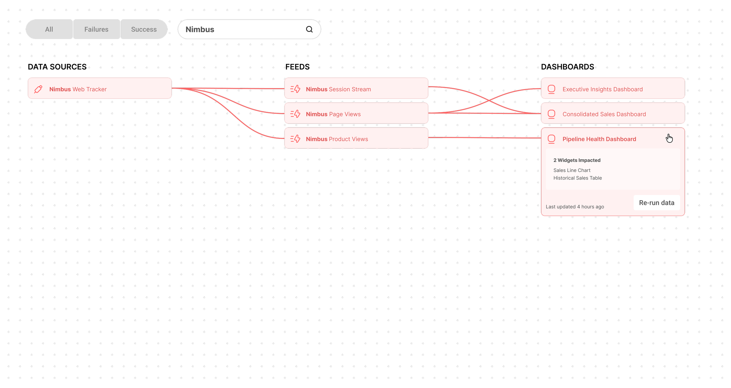
Search to jump quickly: Users can instantly locate specific datasets or systems without scanning the entire diagram.
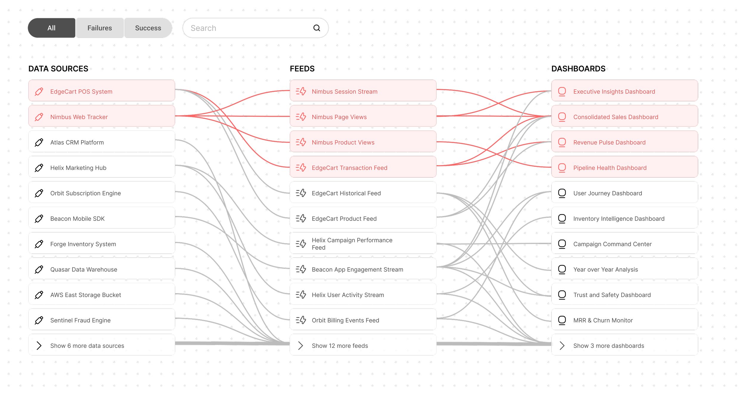
A key design decision was to prioritize failure detection over completeness. In practice, users aren’t studying lineage for curiosity—they’re trying to debug something that’s broken.
To support this, failed states are visually emphasized in red, while successful states are intentionally downplayed. This creates a clear visual hierarchy, allowing issues to surface immediately without requiring heavy cognitive effort.
The result is a lineage tool that shifts from being a passive reference to an active debugging aid—helping users quickly answer the question: “Where did things go wrong?”
Default View
All nodes are visible but nodes with issues are positioned at the top of the diagram.
Searched State
In this view, a user has searched the term “Nimbus” and only nodes containing the term “Nimbus” or connected to any such nodes are visible.